To Encourage Data Use, Focus on Visualization
July 7, 2016 | 4 Minute ReadChristopher Gegenheimer provides practical tips to help monitoring and evaluation professionals better communicate their data.
In the new context of thousands upon thousands of terabytes of data and millions of database rows, monitoring and evaluation (M&E) professionals find ourselves faced with a new reality. We are now expected to not only understand the data ourselves, but then to transform the raw data to something our audiences can easily use for decision-making. This imperative comes directly from the idea of utilization-focused evaluation, which requires that we ask ourselves how the data will be used and by whom even before we design tools and collect anything. If we can’t answer these questions, then why would we collect the data? As a result, data visualization is also a growing area of interest because decision-makers can only use data if they understand it. Without well-thought-out communications, specifically data visualization, we remain wandering in the wilderness.
As I have been working with more data and types of visuals, I’ve realized a seemingly obvious but important point — there isn’t only one way to visualize a dataset. Raw data can have a story, or multiple stories to tell, and how we present the data will influence whether and how it is used. To borrow a line from my college ethics professor, “nothing speaks for itself.” Visualization should facilitate comprehension of data, but without deliberate planning of visuals, we may assume that everyone will see the same thing we see. Stephanie Evergreen provides excellent overviews of these concepts and clear guidance on how to apply this in your work.
In a previous post, Graphic Designer Anna Kuipers discussed misconceptions about data visualization and described how thoughtful planning at the beginning design stages can avoid common pitfalls. Here are more tips we have found helpful when creating visuals.
1. Understand our message before we design anything
Being clear about what we are communicating will guide us in what and how we visualize. An executive summary will require different design than the body of a report. Not every survey question needs its own graph, and often a more high-level graphic that shows trends across multiple data sets is more useful to the reader.
2. Match our message and our data to choose the right kind of graph
Bar charts imply quantity, such as value of sales, and are not always appropriate ordinal for data such as scores, or for hierarchical and relational data. Pie charts can work very well when you want to emphasize one or two parts out of a whole, but become cumbersome with any more than that. Sorry to burst bubbles, but 3D is never the right answer.
3. Identify the message on the graph itself
Instead of assuming readers will know why we chose this data and this visual, provide additional guideposts that walk them through the visualization. These can include a title that more accurately describes the message, clean labels, and narrative that references the graph rather than explains it.
4. Learn from graphic design professionals
We often think of graphic design as simply making the graphics more attractive, but the real focus is making them more readable. We need to choose colors that show contrast best, choose correct label placement, and allow enough white space in the design to reduce eye fatigue. Even the orientation of the graphic on the page can help lead the reader through the data in the most comprehensible order.
The before and after graphs below demonstrate how to put these principles into practice.
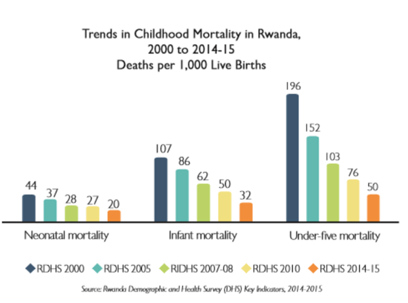
Before: This version is relatively clean, but the time elapsed between each bar is not equal and the graph requires readers to closely reference the legend. With a few changes, we can clarify the data and its message.
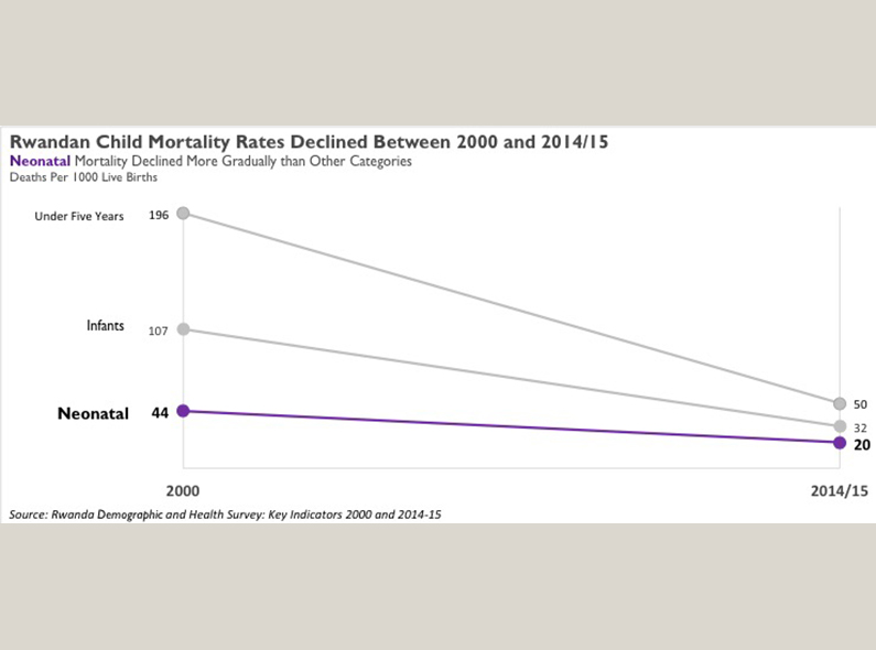
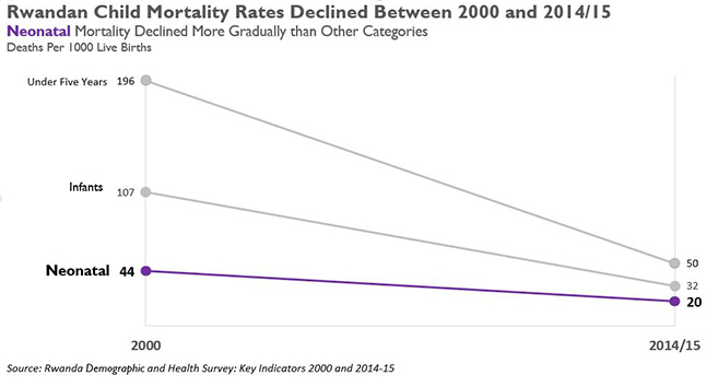
After: By using a slope graph and modifying the title and subtitle, the message becomes clearer to the reader. We also removed the data points between 2000 and 2014/15 to emphasize the overall trend, and highlighted one piece of the data in specific. This version of the graph offers a clear observation, without interpretation.
As we move forward in to our new data-rich age, it will be more important and even expected for M&E professionals to understand how to communicate data. We are often reluctant to provide much beyond the name of the field we graphed for fear of overselling, making unsupported claims or, worse, being accused of misrepresentation. All of these are valid concerns, but it should not prevent us from being clear in our visuals about what is worth paying attention to. We can provide extra guidance in our titles, color choices, and label placement to help our audience about what they are looking out without crossing the line into value judgments or distortion. If our audience can more quickly comprehend data, we will all be in a better position to use these results to better hone our development work in the field.

About Chris Gegenheimer
Chris Gegenheimer is a director for Monitoring, Evaluation and Learning (MEL) Technology and leads efforts in rolling out new data collection, management, analysis, and visualization technologies across home and project offices. Since joining Chemonics, Chris has been in the MEL department supporting proposal and project teams in Latin America and the Caribbean, Asia, Africa, and…